
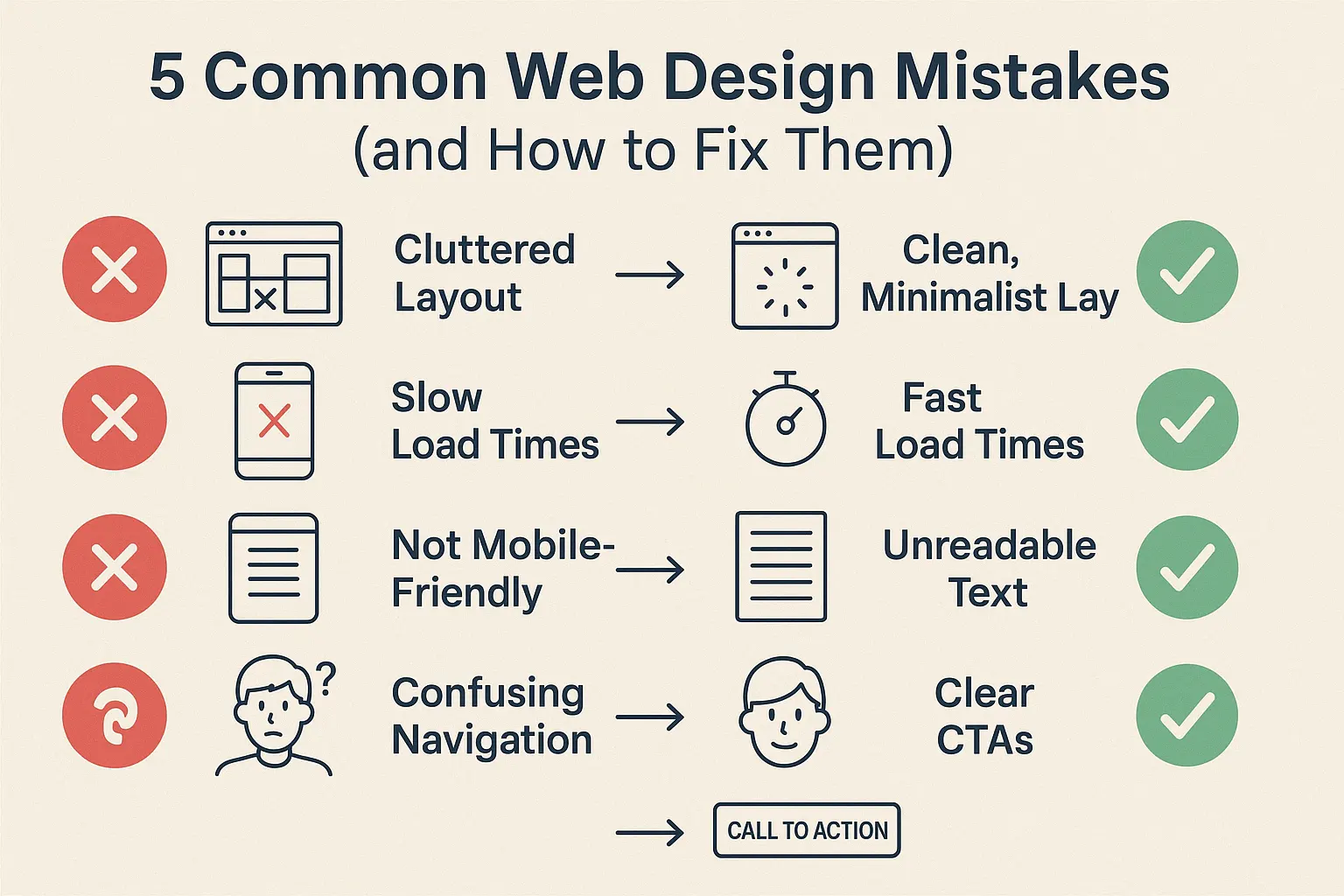
5 Common Web Design Mistakes (and How to Fix Them)
Your website is often the first impression your brand makes — but even the best intentions can lead to poor user experiences. If your site isn’t performing, there might be hidden design errors holding it back. Let’s break down the five most common web design mistakes — and, more importantly, how to fix them.
❌ 1. Cluttered Layout
The Problem:
Too many elements packed into one screen overwhelms users and makes it difficult to focus on what’s important. Clutter kills conversions.
The Fix:
- Apply white space generously to separate elements.
- Use clear visual hierarchy (like headings, subheadings, and calls-to-action).
- Focus on the “one goal per page” principle.
👉 A clean, minimalist layout directs attention and improves usability.
❌ 2. Not Mobile-Friendly
The Problem:
Over 60% of web traffic comes from mobile devices — yet many websites still break or look bad on small screens.
The Fix:
- Use responsive design frameworks (like Bootstrap or Tailwind CSS).
- Test across devices using tools like Google Mobile-Friendly Test.
- Simplify navigation and avoid hover-only interactions.
👉 A mobile-optimized site keeps users engaged and improves your SEO.
❌ 3. Slow Load Times
The Problem:
Users leave if a site takes more than 3 seconds to load. Slow websites damage SEO rankings and kill conversions.
The Fix:
- Compress images without losing quality (use WebP or AVIF formats).
- Minify CSS/JS files and reduce HTTP requests.
- Use CDNs and reliable hosting providers.
👉 Speed isn’t just nice — it’s essential.
❌ 4. Poor Readability
The Problem:
Tiny fonts, bad contrast, and long paragraphs make your content hard to read and frustrate visitors.
The Fix:
- Use at least 16px font size for body text.
- Ensure strong contrast between text and background.
- Break up text with headings, bullets, and visuals.
👉 Good typography and spacing keep users reading and scrolling.
❌ 5. Lack of Clear CTAs (Call-To-Actions)
The Problem:
If users don’t know what to do next, they’ll leave. Many sites hide or fail to use clear CTAs.
The Fix:
- Make your CTAs bold, visible, and action-oriented (e.g., “Get a Quote”, “Start Free Trial”).
- Use contrasting button colors that stand out.
- Place CTAs at the top, middle, and bottom of long pages.
👉 CTAs should guide users to the next logical step — every time.
💡 Final Thoughts: Make Your Website Work for You
A beautiful website isn’t enough — it must be functional, fast, and user-focused. If your site suffers from any of these issues, now’s the time to act.
🚀 At MT Shamser, we specialize in building conversion-driven, SEO-friendly, and mobile-first websites that avoid these costly mistakes from day one.
Need help fixing your site?
👉 Get in touch today and let’s build something your audience will love.


https://vitz.ru/forums/index.php?autocom=gallery&req=si&img=4814
Good https://shorturl.at/2breu
Awesome https://lc.cx/xjXBQT